
I designed solutions to complex eSIM edge cases for Galaxy S24. Since eSIM was a moderately new technology, I worked through constant iterations, cross-functional collaboration, and user testing to create a smoother UX.
eSIM (Embedded SIM) is a digital SIM directly built into a device at the point of manufacture—removing the need for a physical SIM card.
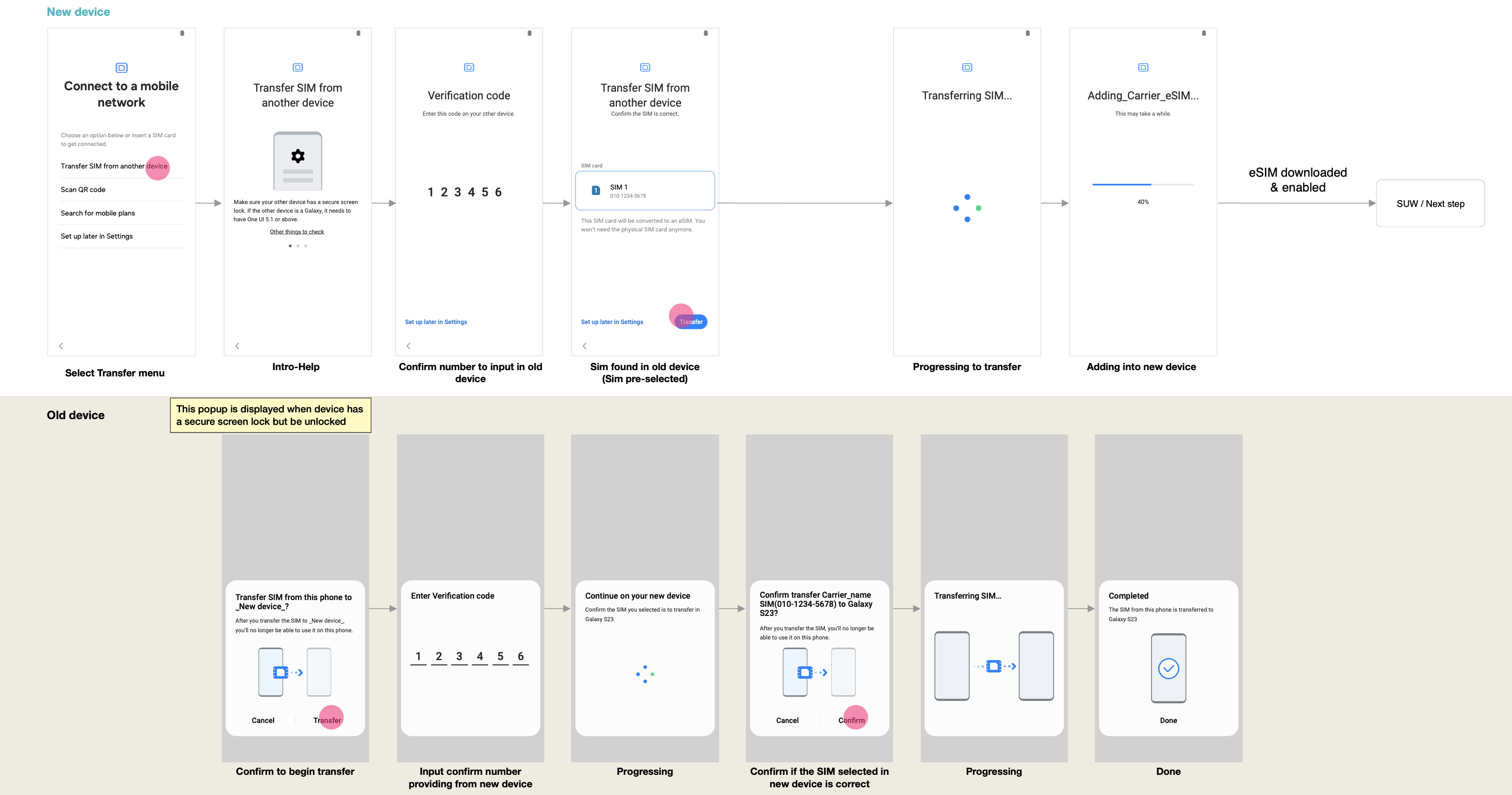
We started with one main eSIM flow. My role was to design solutions to address edge cases.
The 2 features above (1) Unlocking eSIM (2) Bootstrap Connection, are what we will be shown end-to-end today.
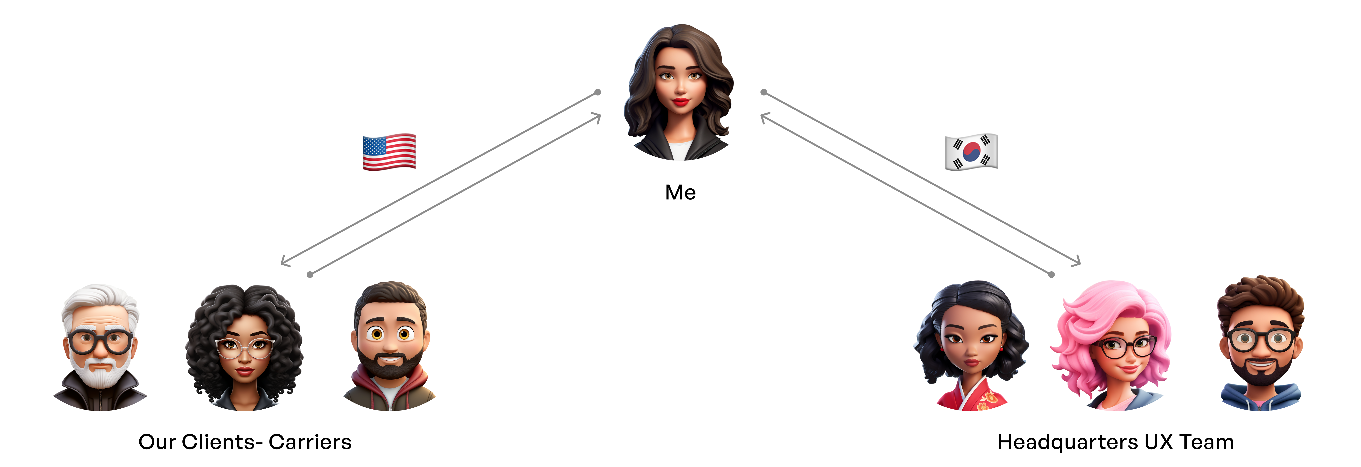
Representing the Samsung US office, I collaborated daily with global carrier partners and Samsung HQ across time zones.
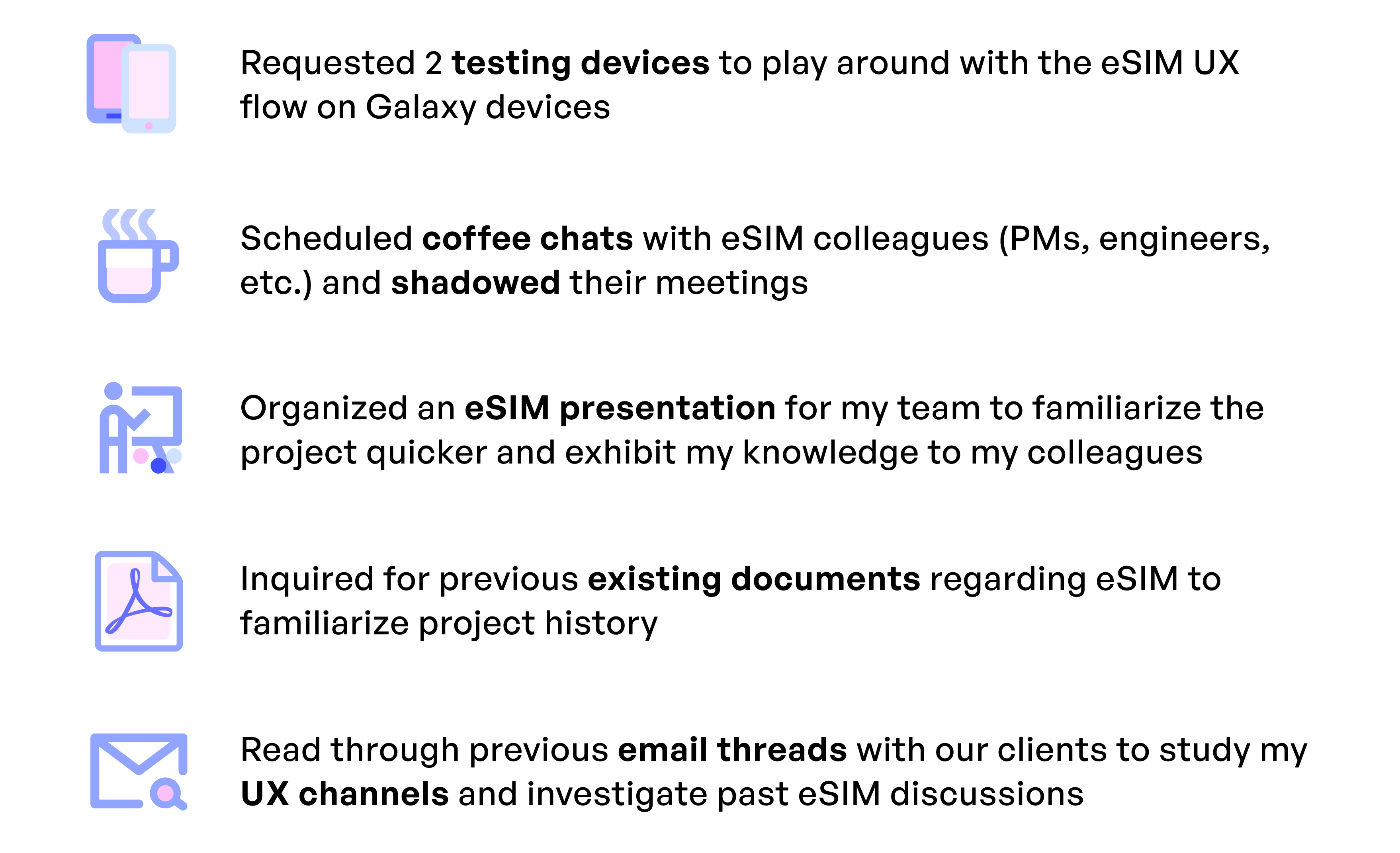
Although I was excited to enter a niche project, it came with a steep learning curve since eSIM was still in its early stages. Here’s how I built ownership during my first three months.
eSIM was still immature and unfamiliar to both users and carriers. Early prototypes revealed two recurring pain points:
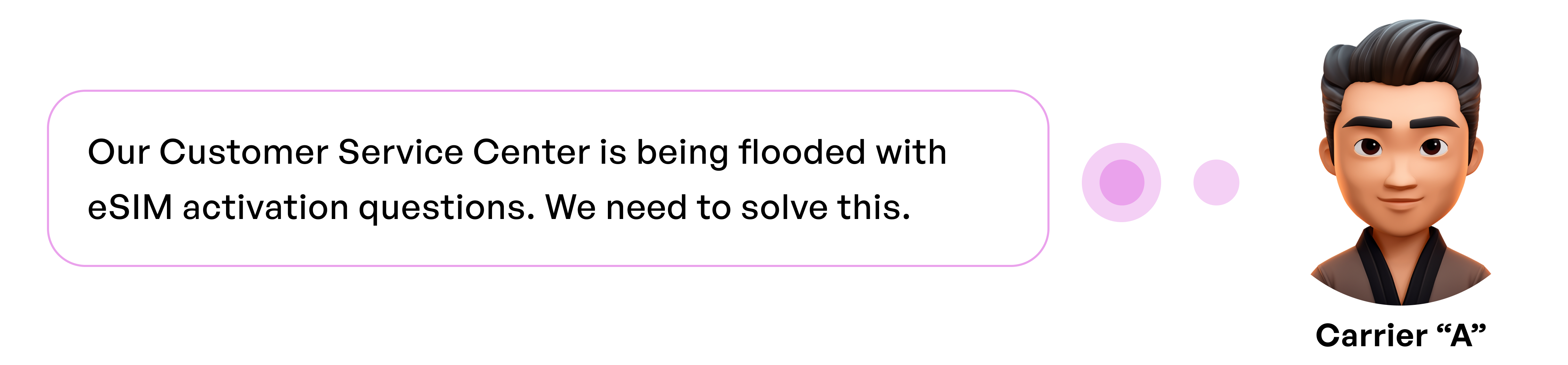
Both problems increased frustration, drop-offs, and calls to customer service, which carriers and Samsung wanted to minimize.
Design a user experience that enables smooth eSIM activation without requiring calls to customer service
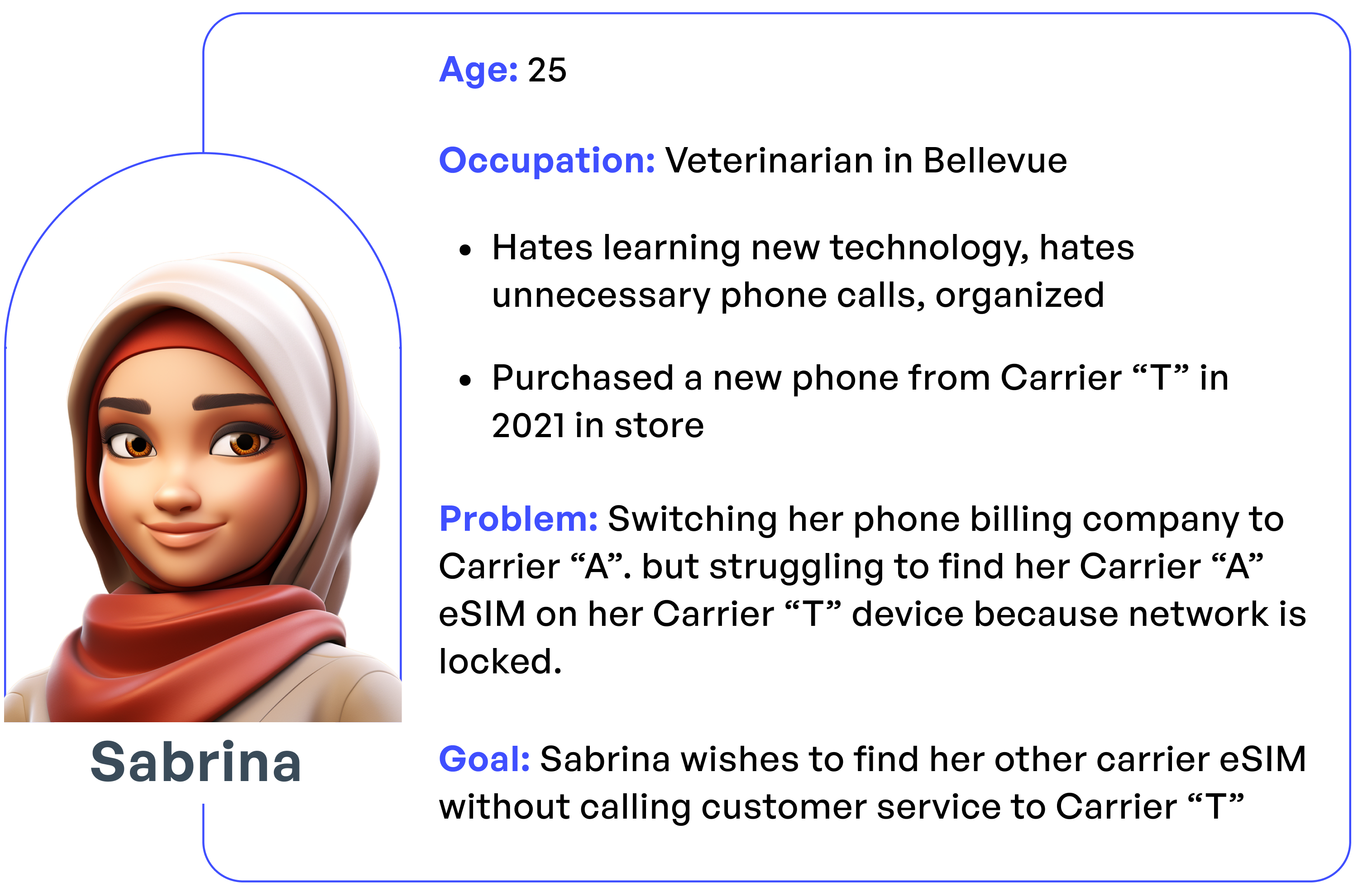
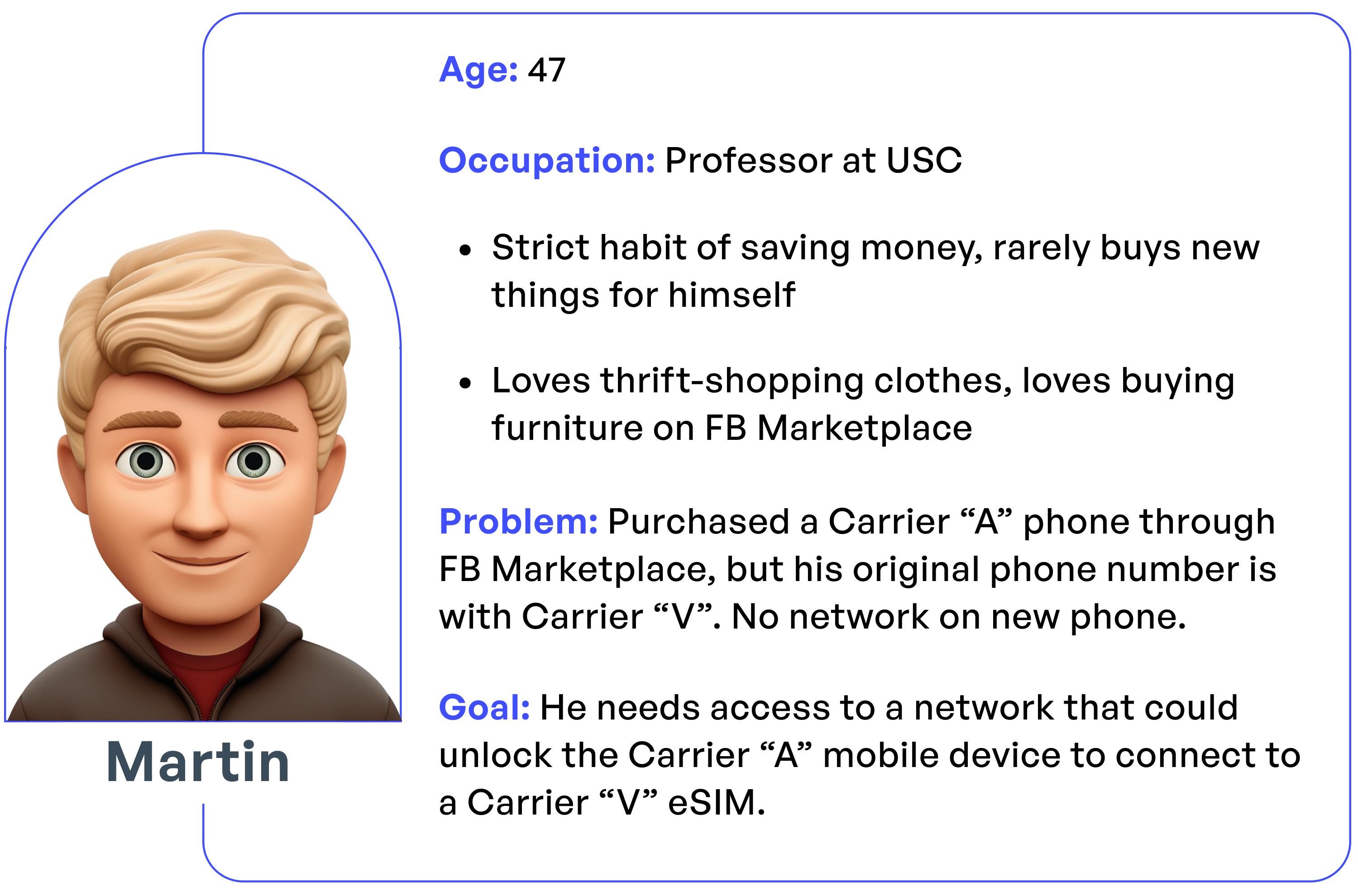
I joined bi-weekly calls with customers and carriers. Feedback revealed recurring frustrations:
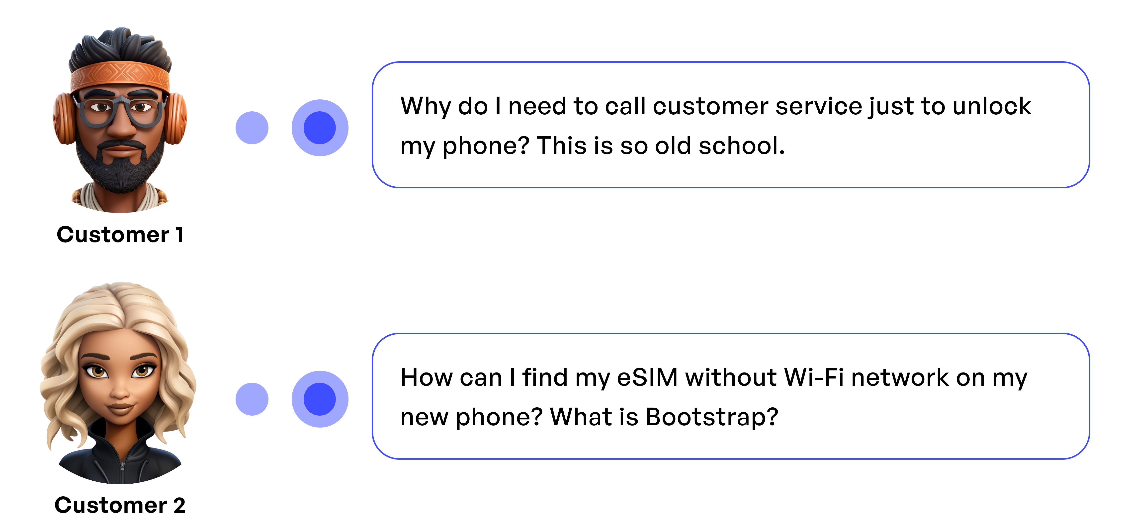
Keyword Analysis: Our UX team tracked frequent phrases like “call customer service,” signaling major usability blockers
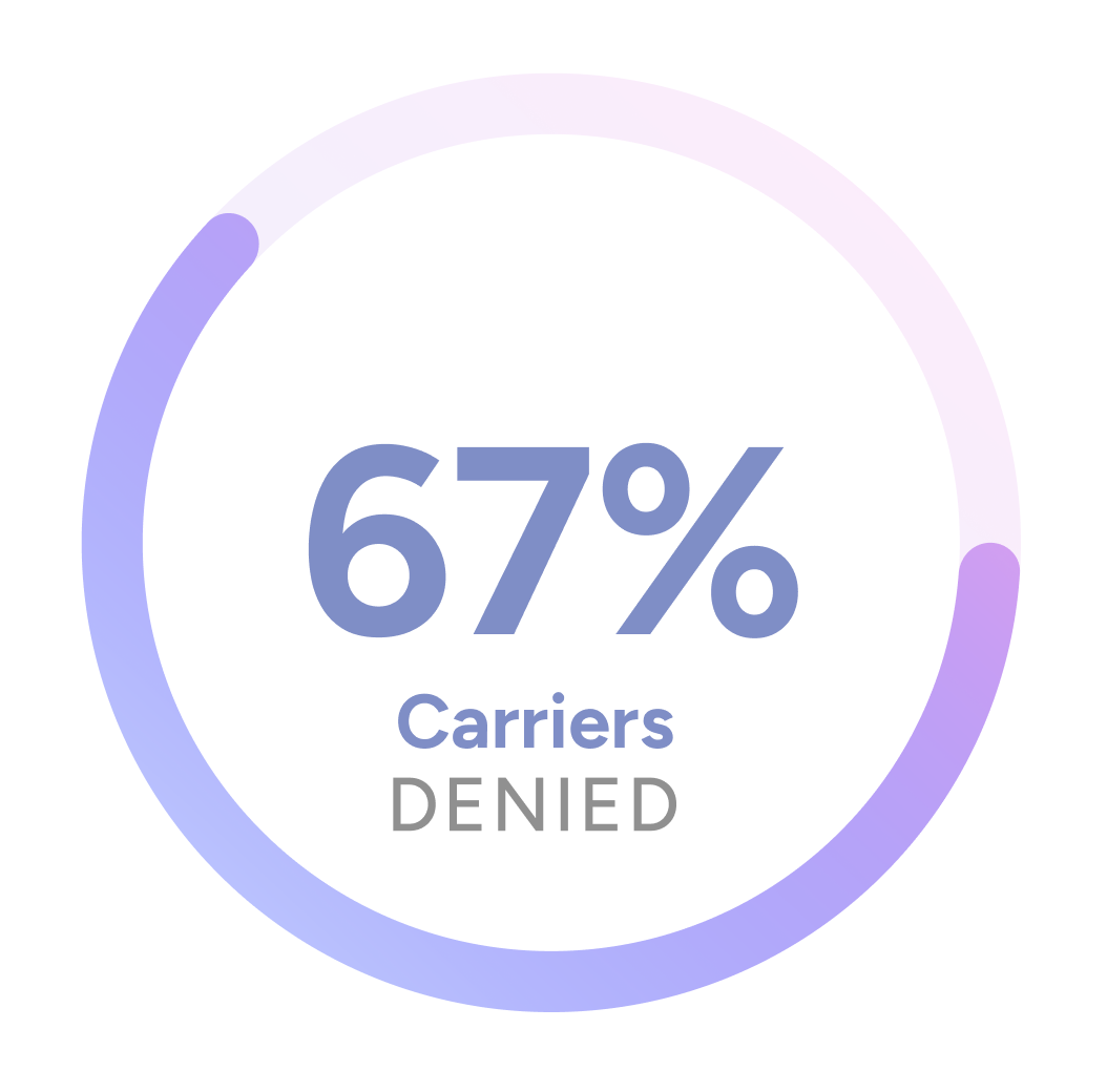
Business Context: Carriers were reluctant to unlock networks freely, preferring solutions that kept users in their ecosystems.
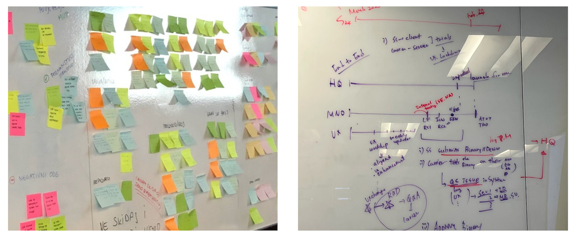
I presented stages of proposals to my clients after receiving the feedback.
Requested our clients to unlock network on devices, but 67% of the carriers have denied
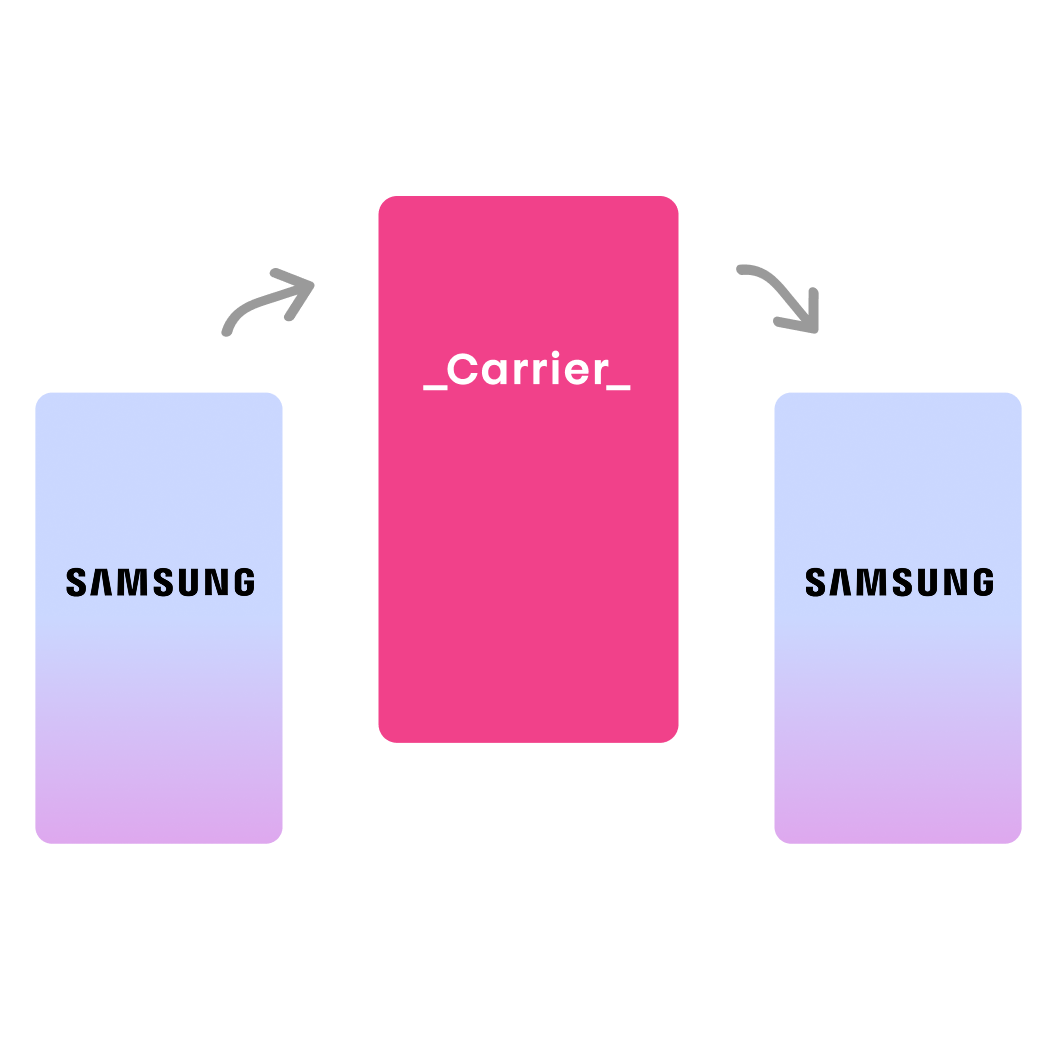
Compromise on an interface that leads to temporary Carrier Webview, which returns to Samsung UI
Proposal 1 was denied due to a business conflict of carriers wanting to retain customers.
Proposal 2 became the solution. Carriers handled authentication on their interface, and users automatically redirect to Samsung’s activation flow.
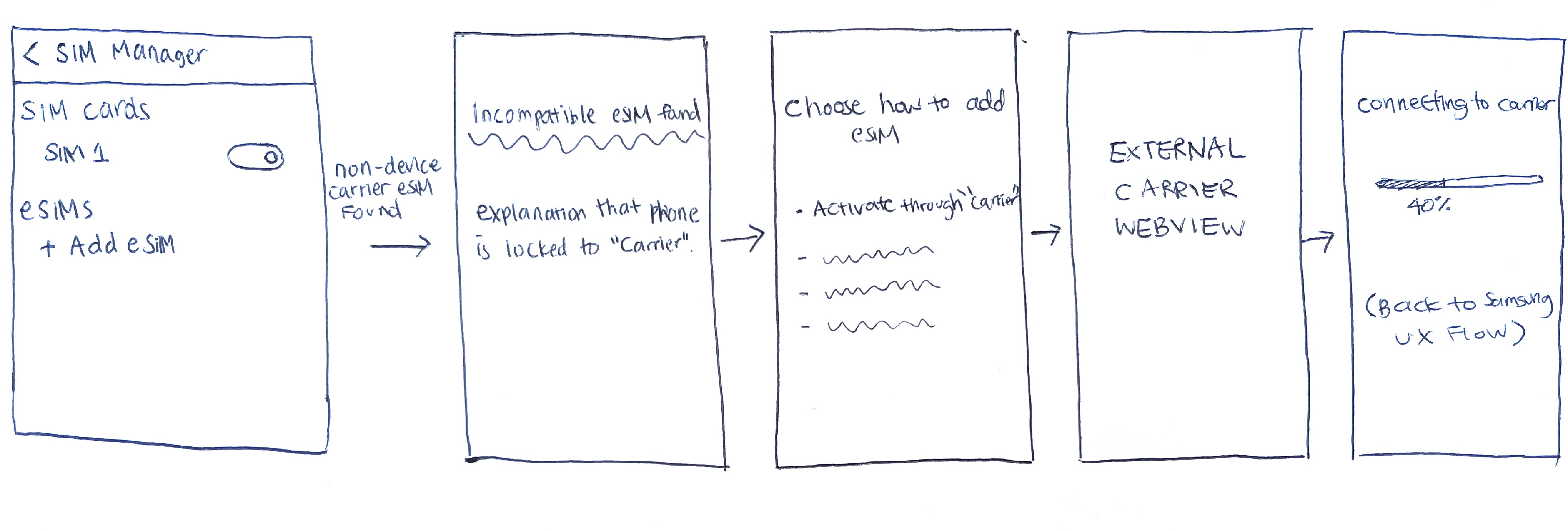
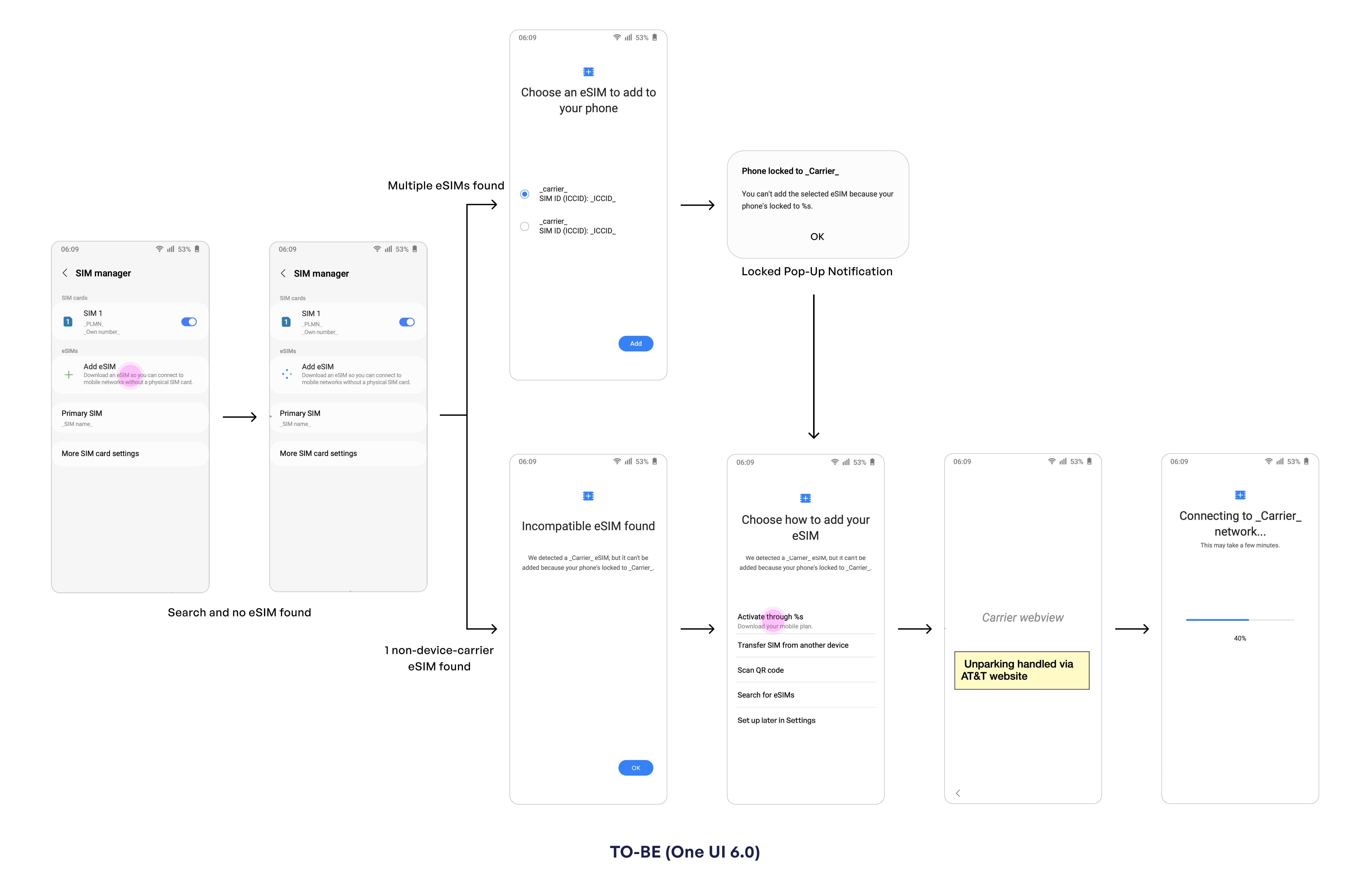
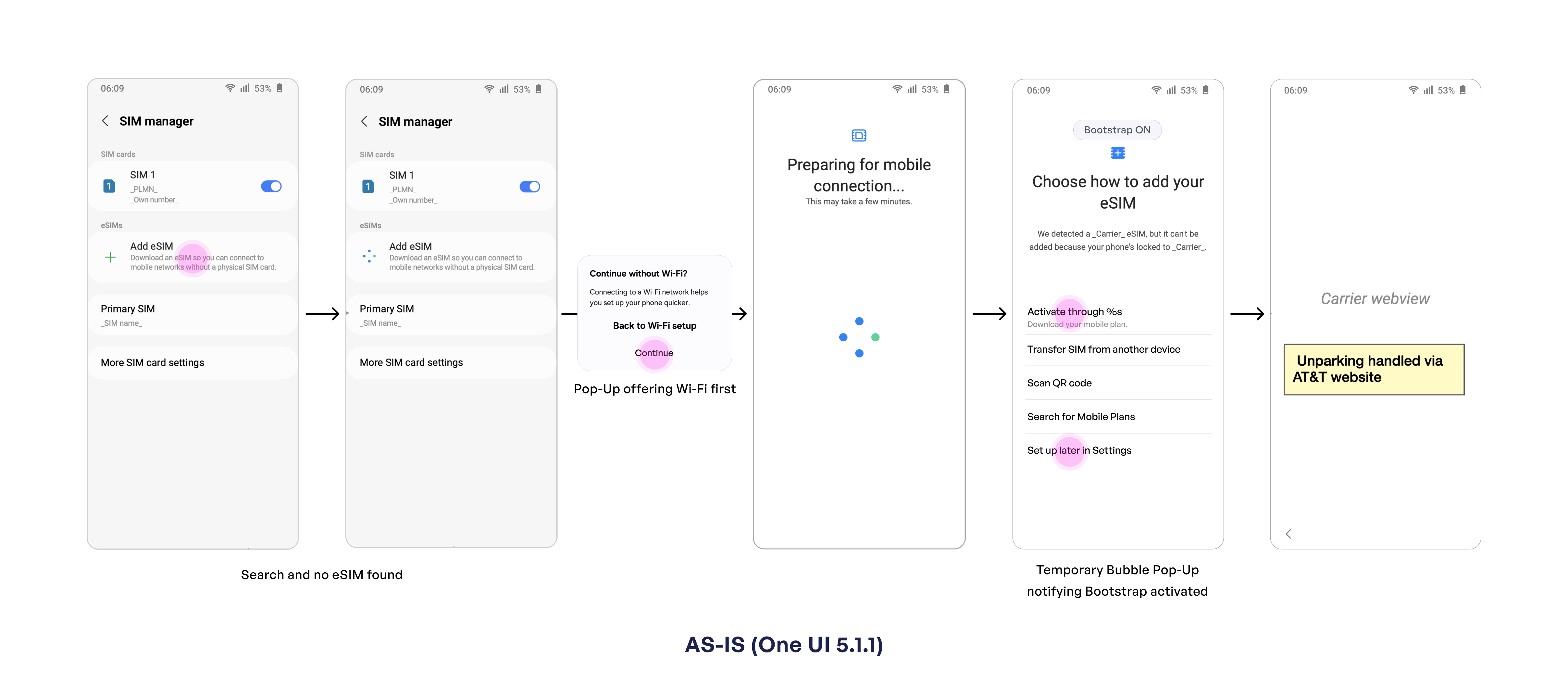
The last frame of the user flow is the issue that needed to be replaced so that (1) We keep users on our interface (2) account for when multiple eSIMs are found, 1 device carrier eSIM found, or 1 non-device carrier eSIM found.
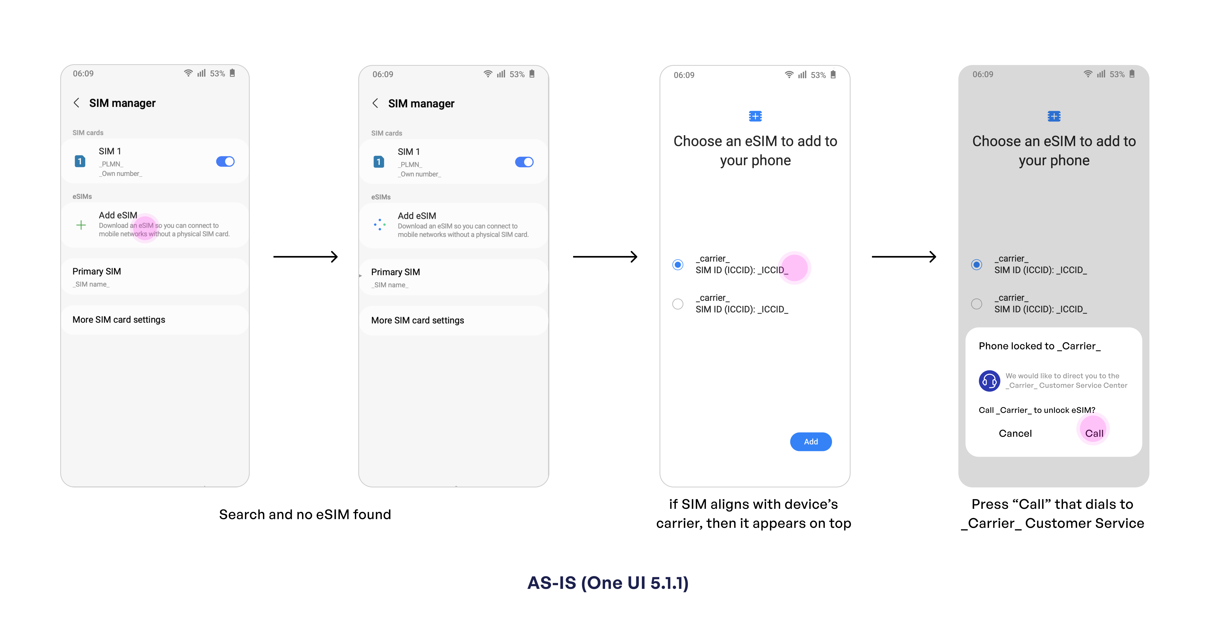
I tried to align the UX with our goal of "keeping users on the Samsung interface".
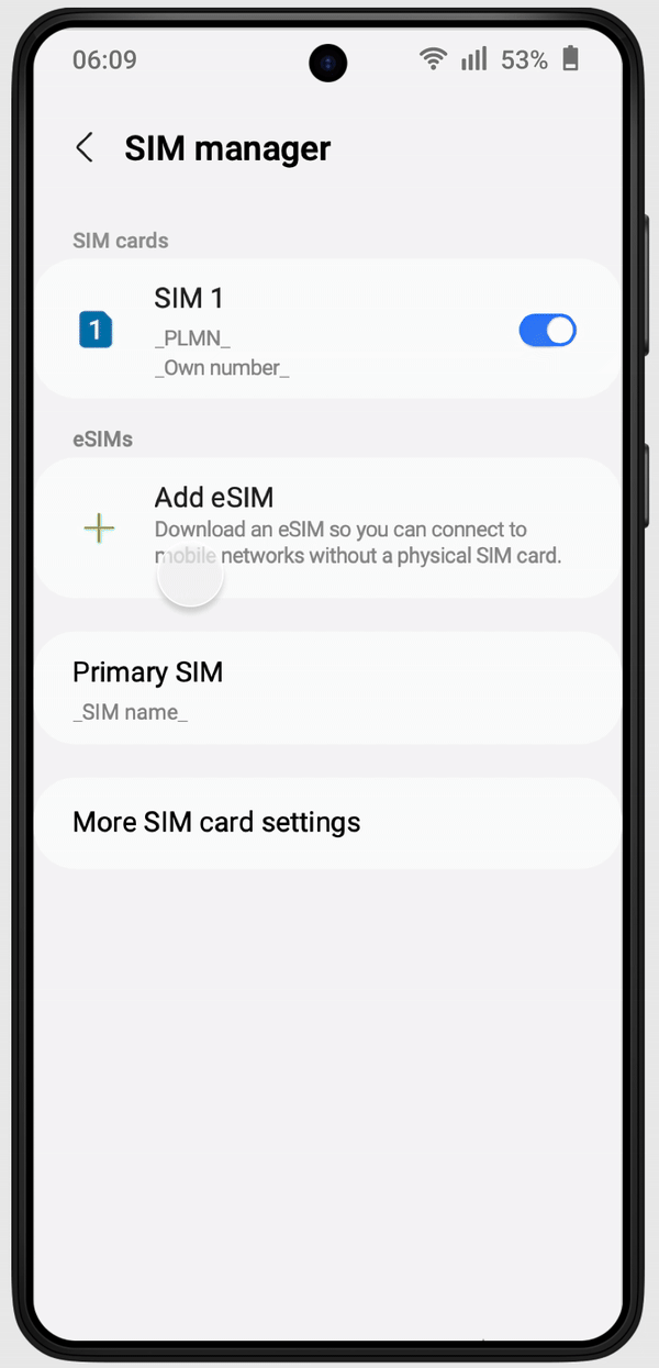
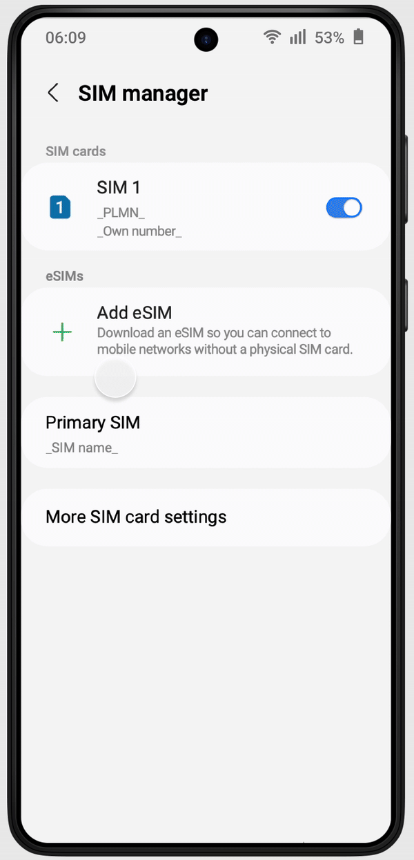
In cases where multiple eSIMs are found, users are displayed with a bubble pop-up notifying them about their locked eSIM. When they click "OK", they will be led to "Choose how to add your eSIM".
This will remove the need to call, while maintaining Samsung’s product experience.
Bootstrap: temporary network connection that only functions during eSIM activation when users do not have access to Wi-Fi
Another common issue was users being unable to activate eSIMs without Wi-Fi access.
As seen on the fourth frame "Choose how to add your eSIM", a small bubble briefly showed “Bootstrap ON” for 5 seconds—often missed by users.
Add a permanent countdown timer so users understood Bootstrap was temporary
How might we use visual design to inform users that Bootstrap is activating but temporary?
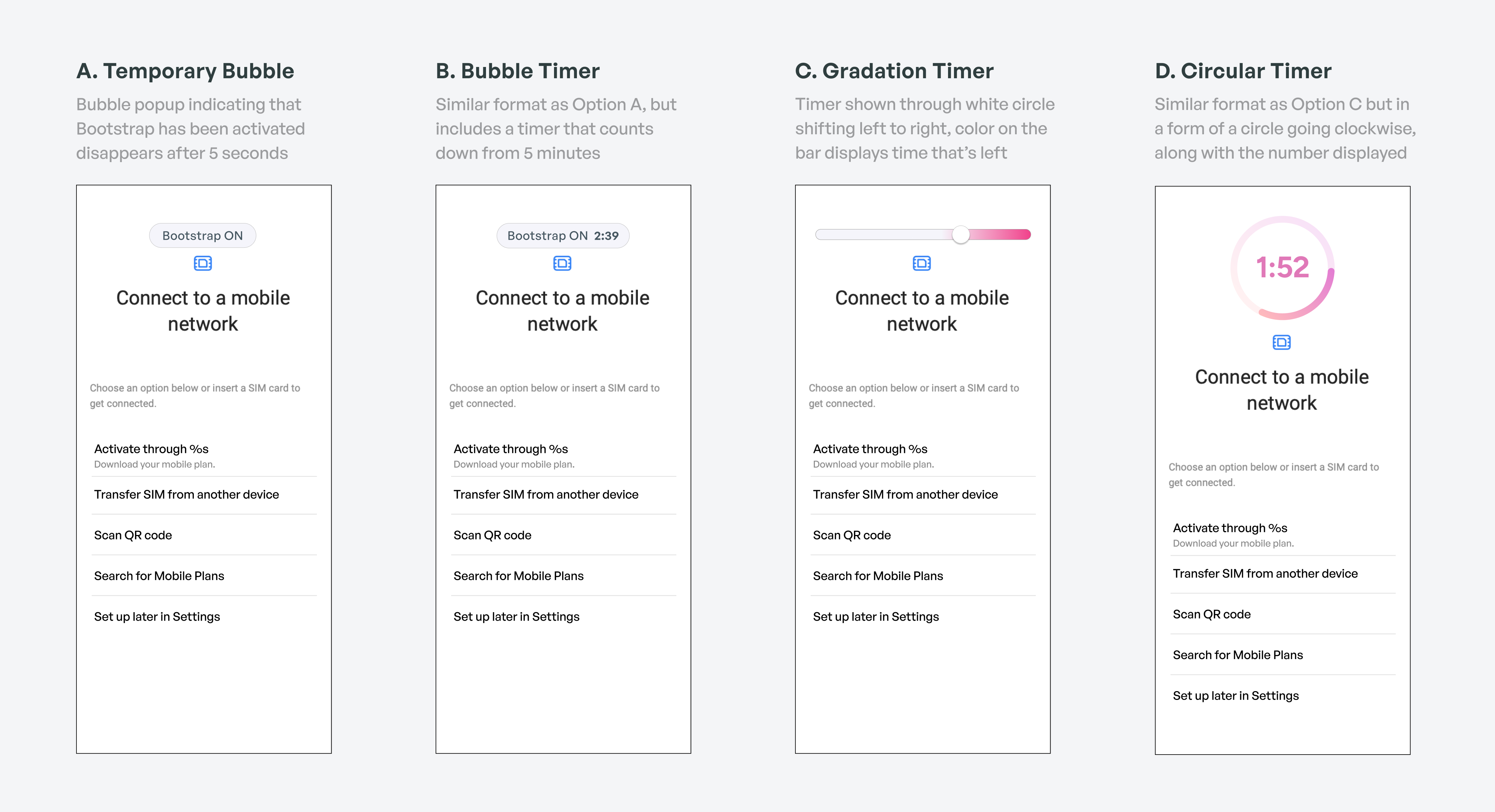
Option D is a combination of B and C, including both the motion of time being reduced along with the timer. We eliminated it because the circle was taking up too much space even though it wasn't the dominant feature.
For the next steps of Usability Testing, Option C and D are not covered because they are more experimental.
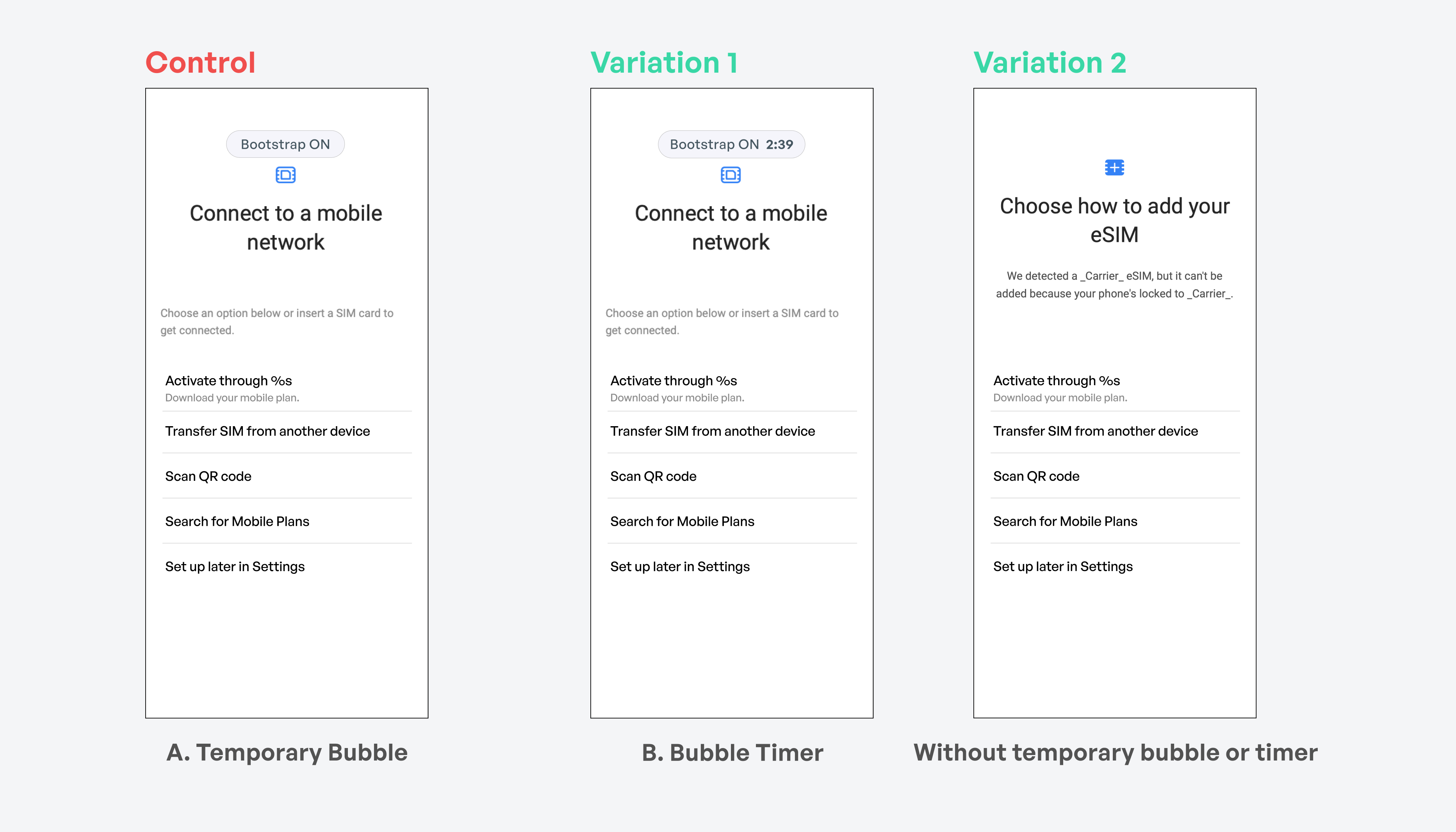
We tested 3 variations, and Invisible Bootstrap produced the highest success rate. Although we assumed a countdown timer might boost conversions by creating urgency, it actually decreased conversions by 2.73%.
Urgency proved harmful: the timer left users feeling pressured and disoriented.
Bootstrap runs silently in the background. Users focused on eSIM activation without distraction.

📈 Core Metric – Successful eSIM activations increased by +3.52% post-launch
☎️ Customer Support – Reduction in calls for carrier unlock and Wi-Fi issues
🤝 Stakeholder Alignment – Balanced carrier business needs with Samsung’s UX standards
Creating testing trials that don't end up as the final design still contributes to significant data
I carried a notebook during onboarding to capture new terms, systems, and documents daily
Tracking metrics post-launch helped me connect UX decisions to tangible outcomes
A daily to-do list helped me stay motivated, organized, and on track